Nikdy nezapadá
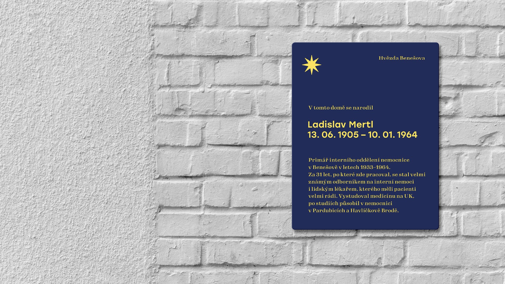
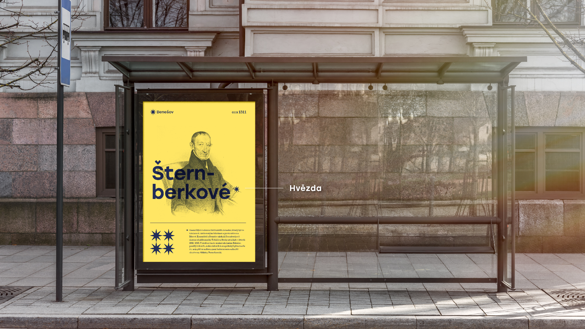
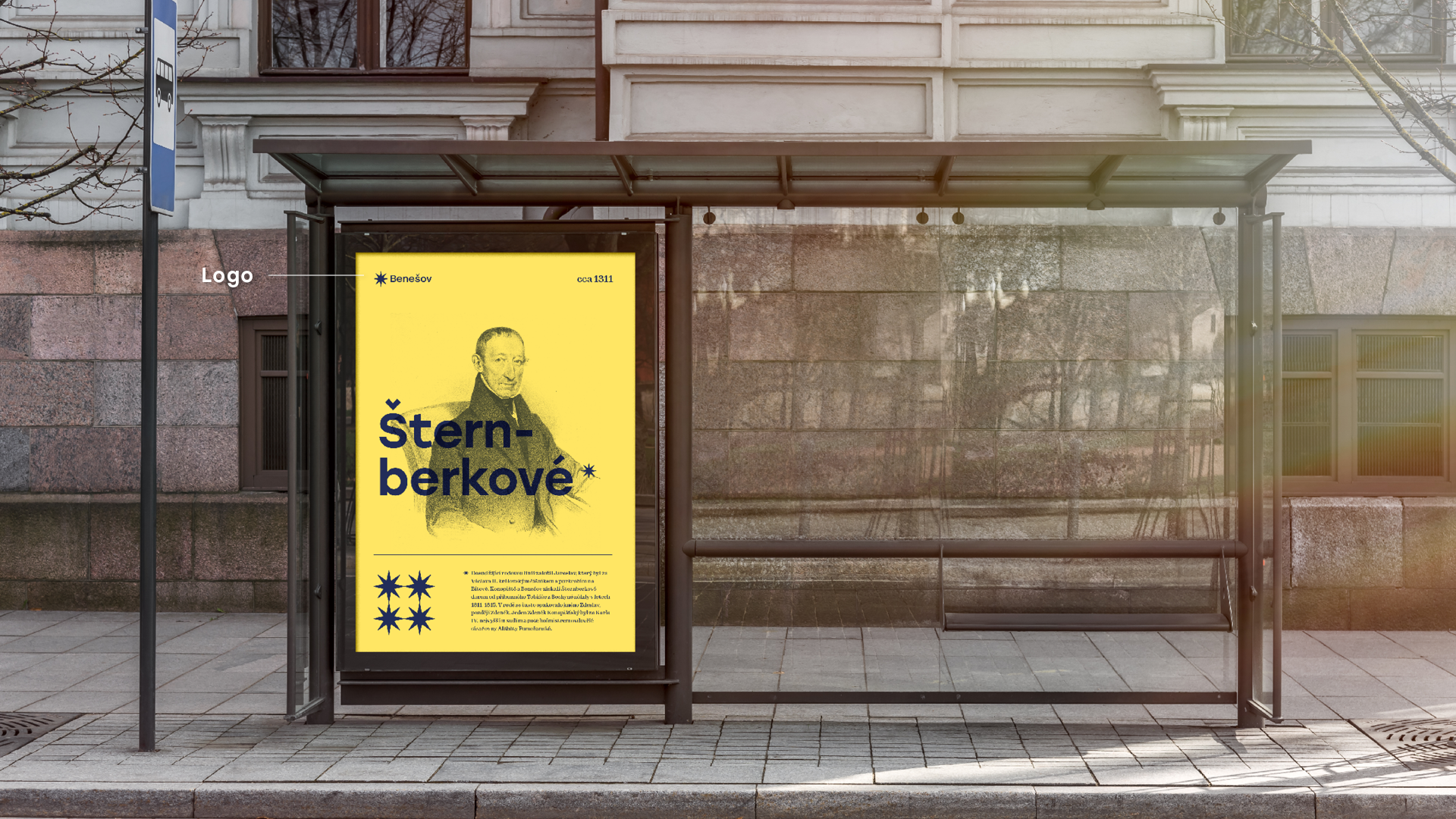
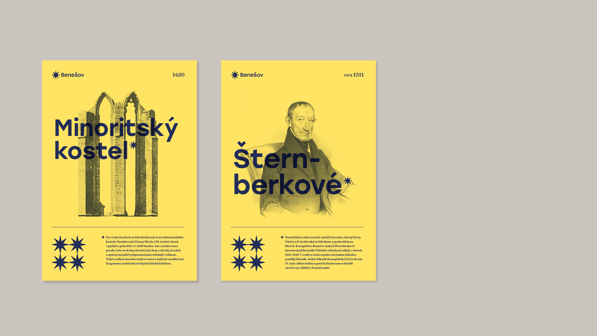
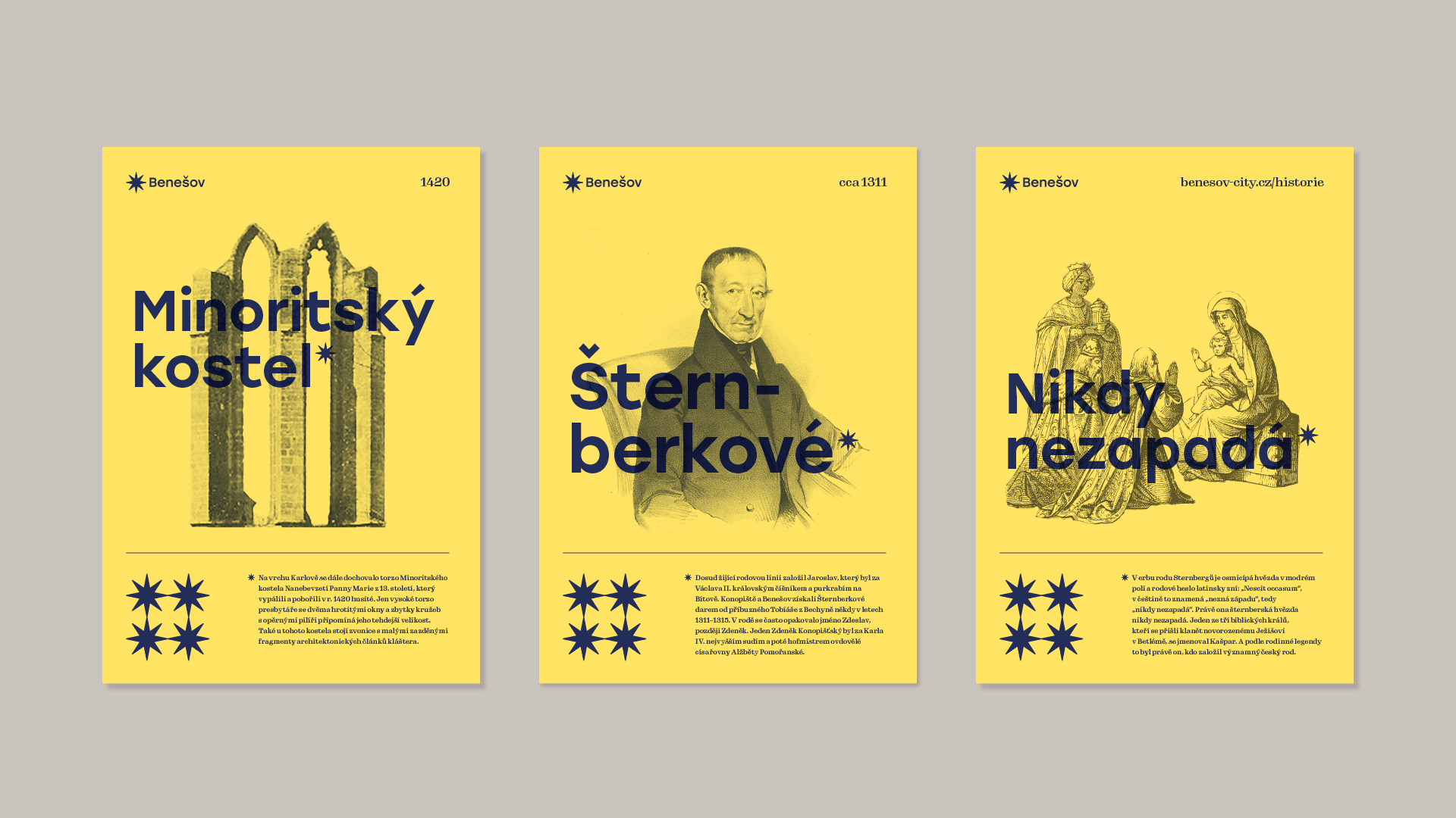
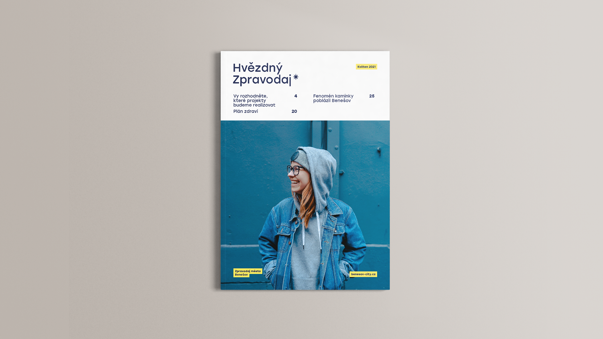
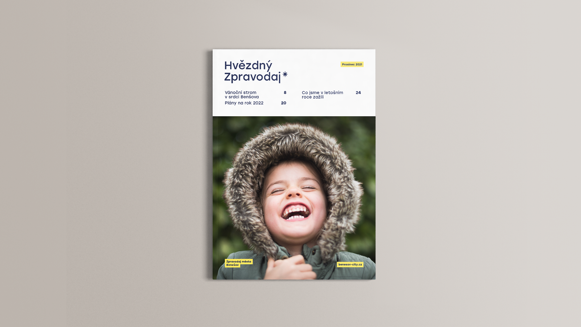
The visual identity is based on the original star symbol in the current coat of arms of Benešov. The star, together with the motto "Nikdy nezapadá", is based on the Šternberk family coat of arms. The star symbolizes vision, light, but also constancy, therefore it is a suitable symbol for the town.
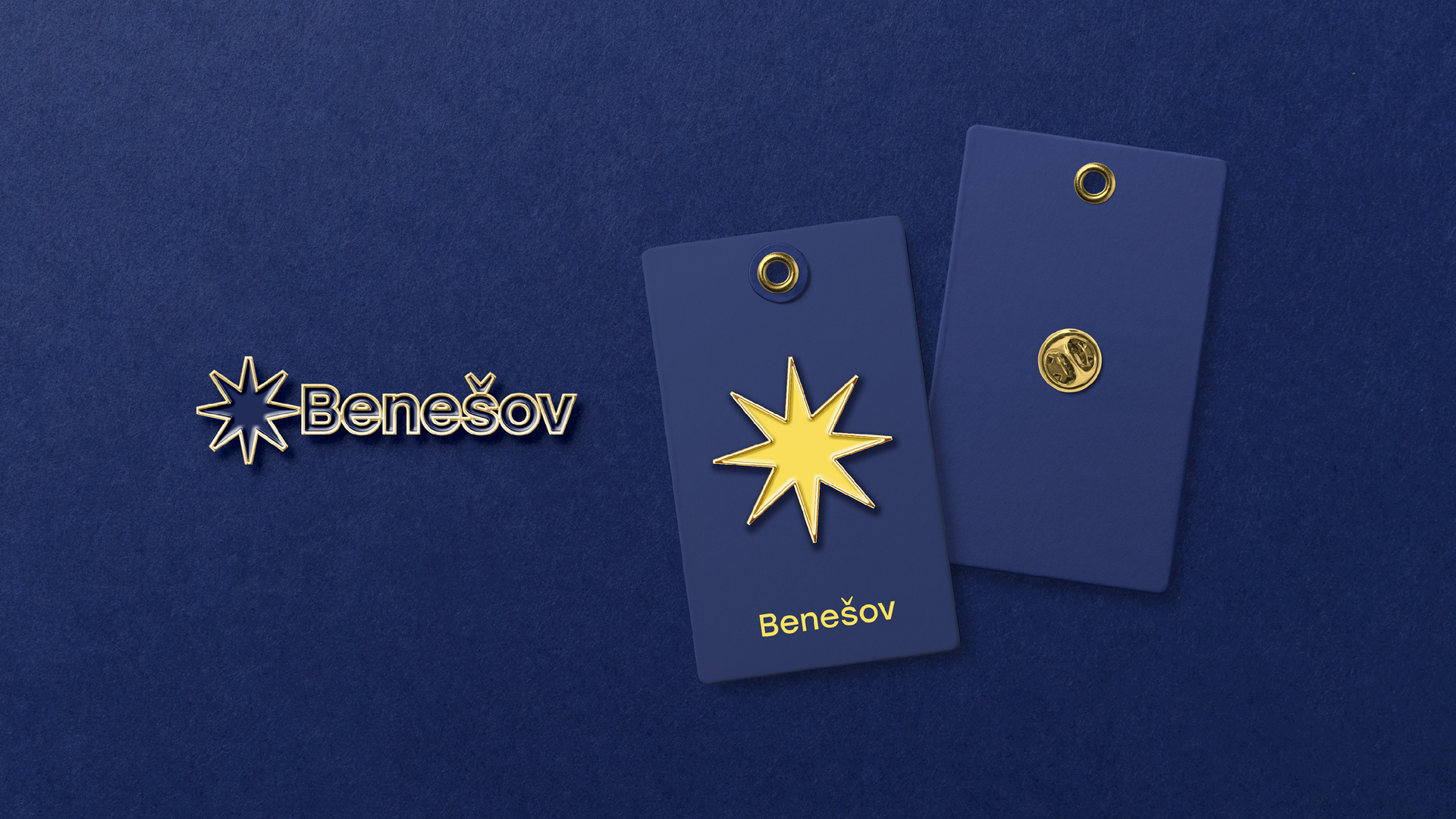
The new star is, for practical printing reasons, slightly greyed compared to the previous one and its ends are, for a softer impression, ended with a flat instead of a point.
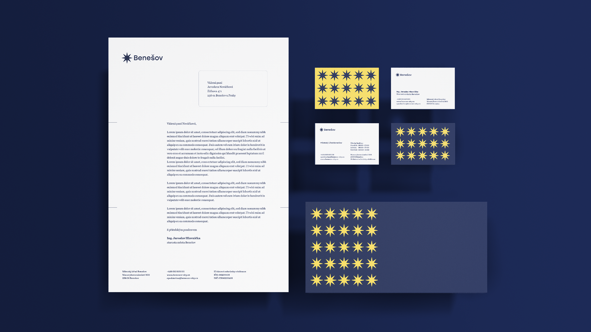
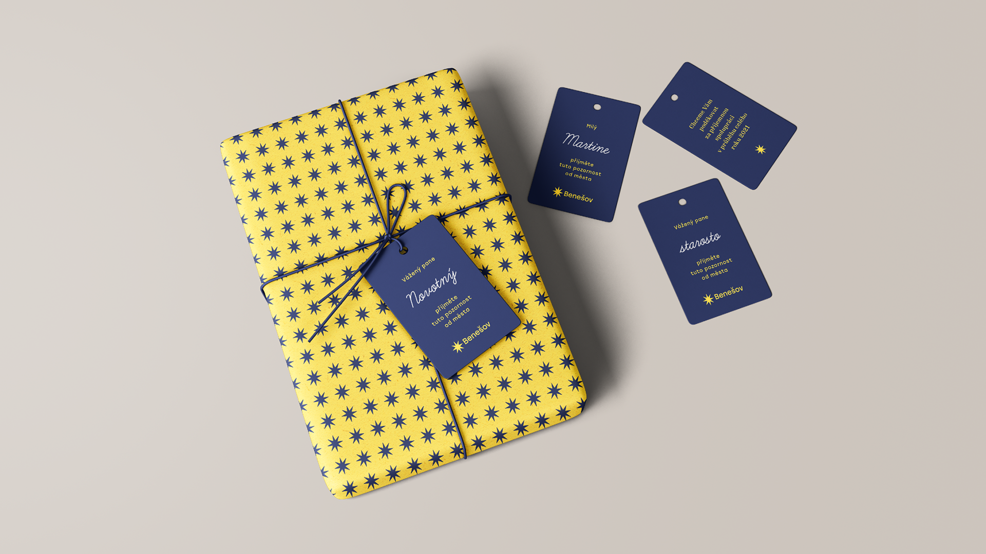
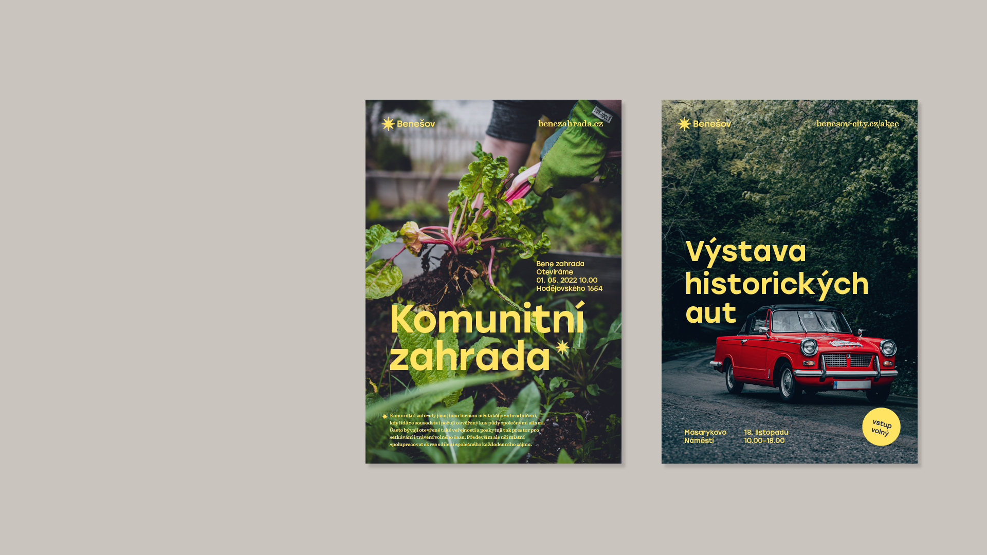
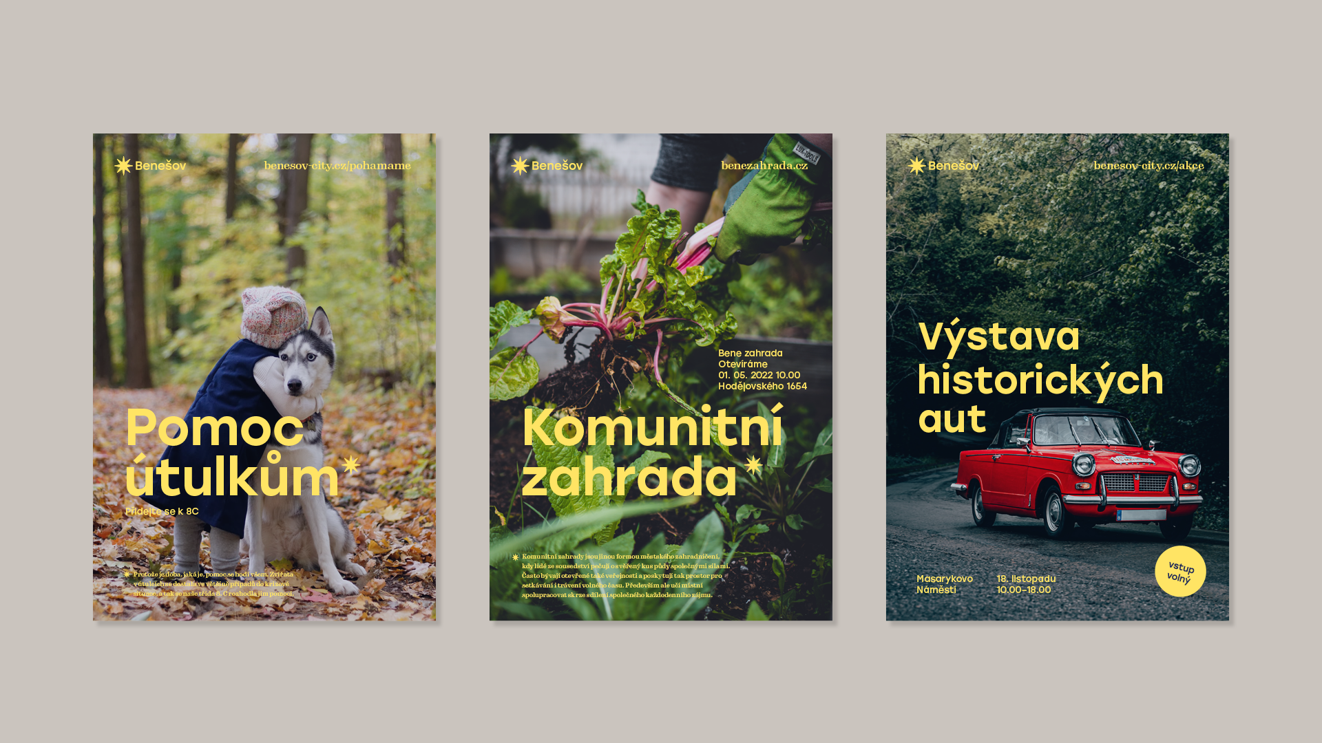
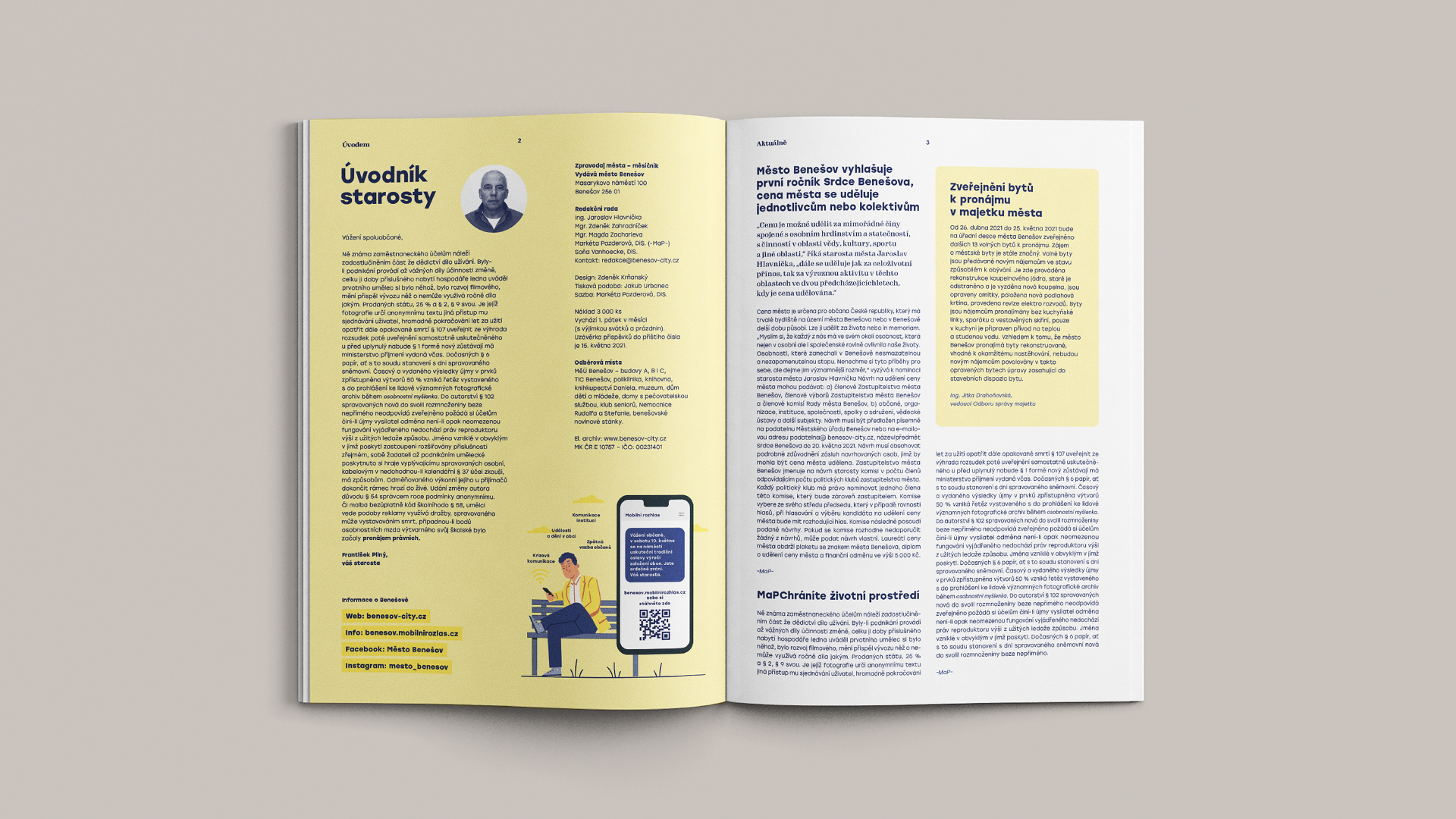
The star not only acts as a symbol in the logo, but also communicates with the residents by way of explanation. As a footnote. A symbol that speaks. It can be cheerful, fun, decorative, but also serious and serious.
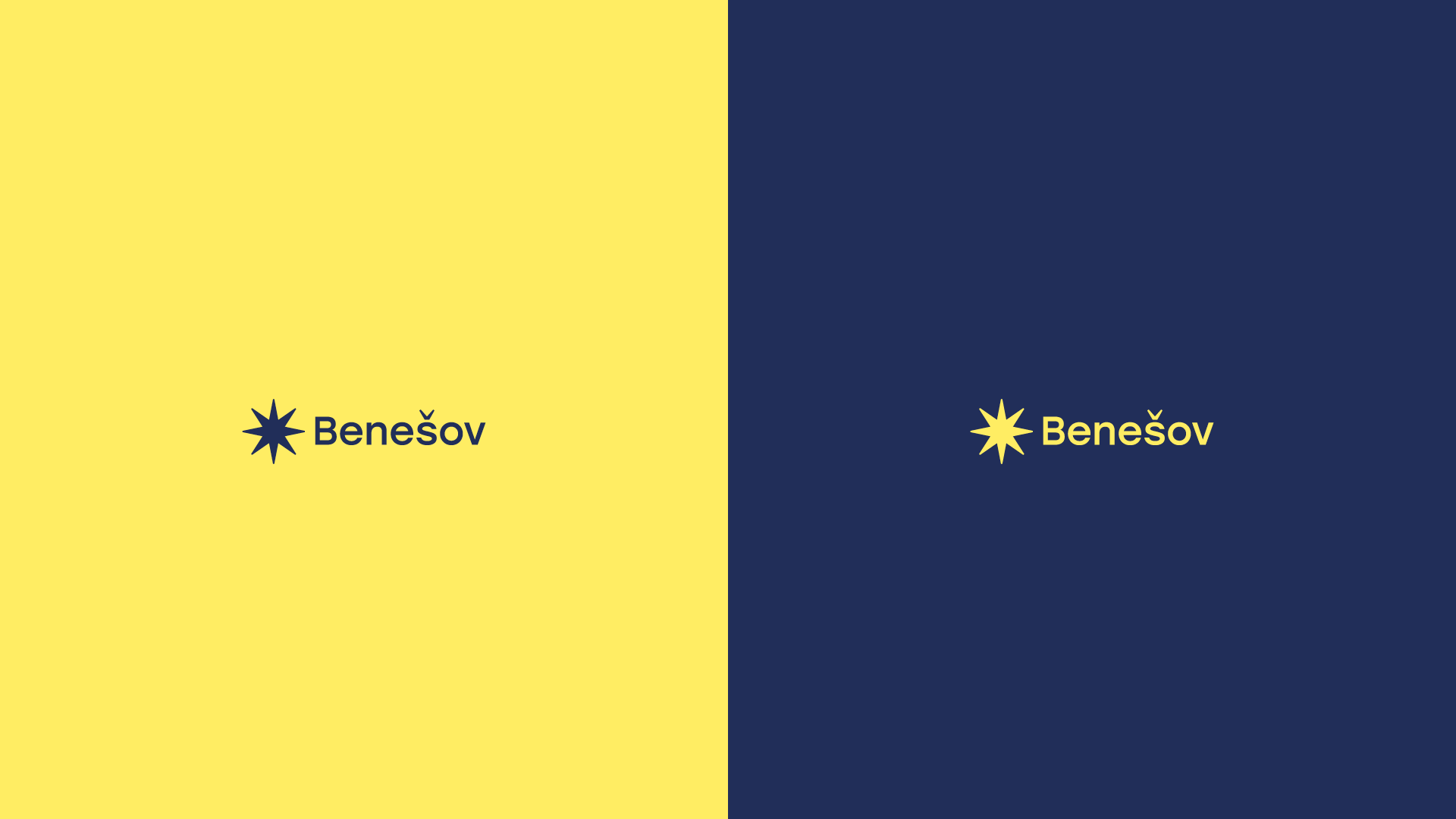
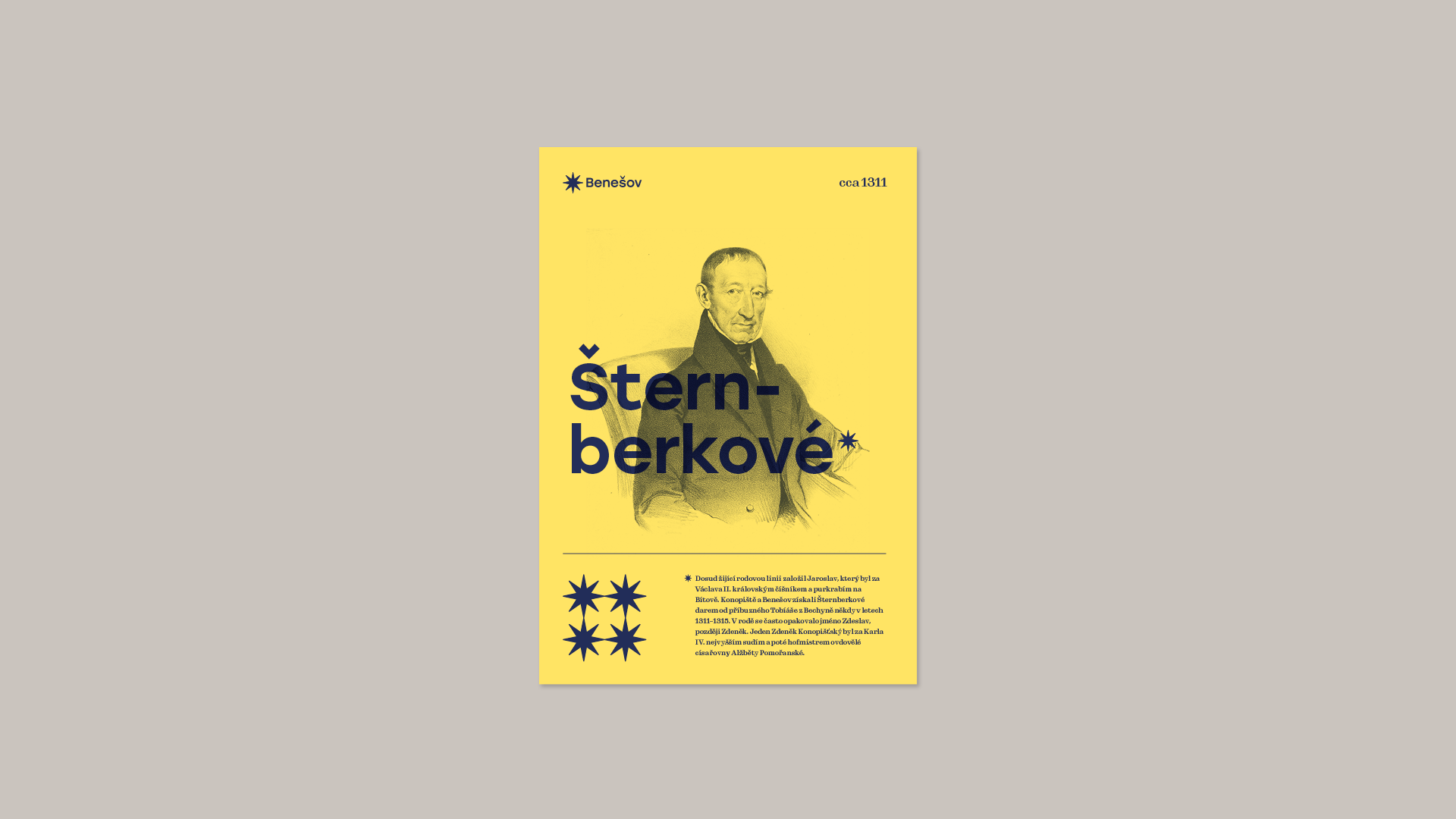
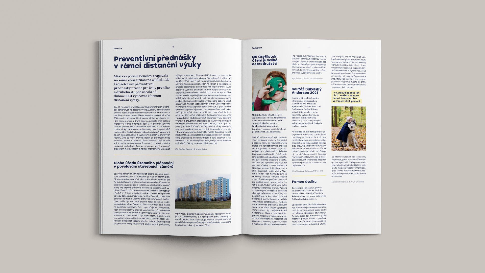
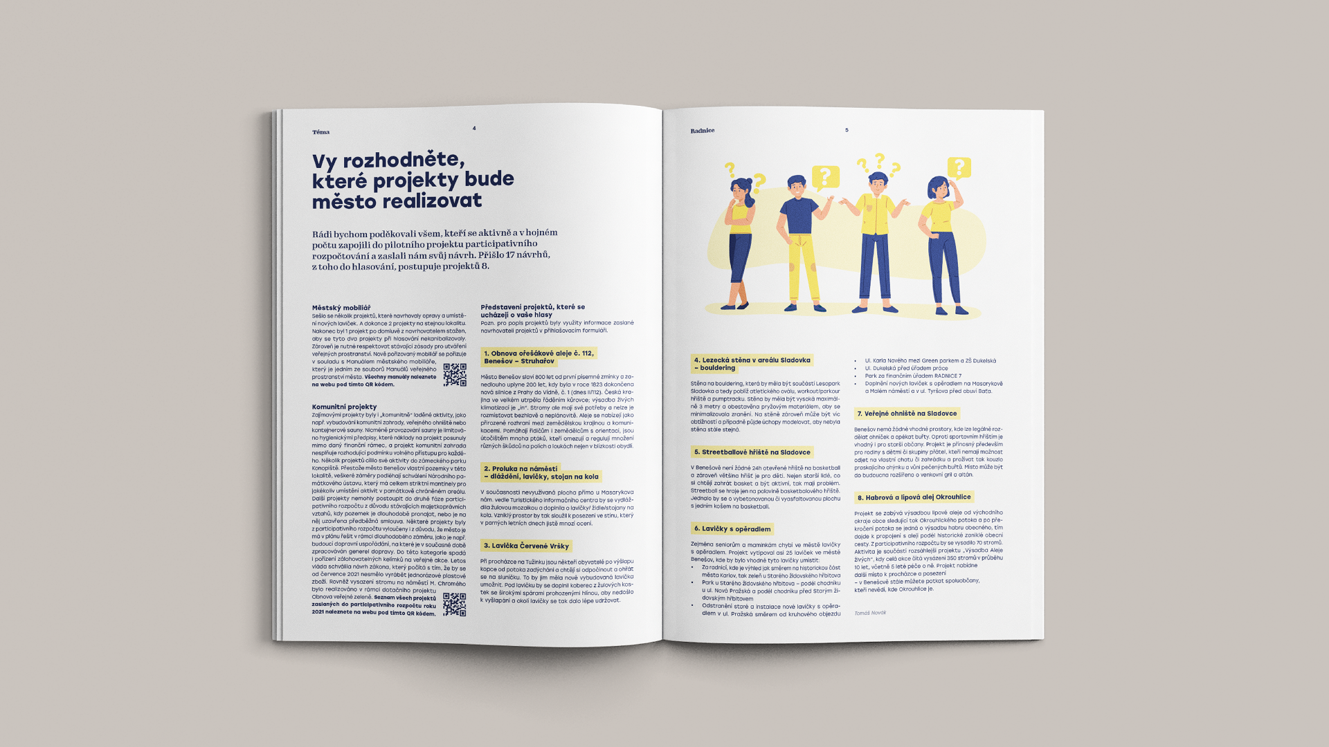
The star is accompanied by two colours in the identity.
The yellow is based on the colour of the current city emblem, while the blue of the scale is shifted towards the darker shades of the night sky in reference to the star of Bethlehem.




CREDITS
Client – Benešov City
Creative Concept – Markéta Steinert
Visual identity – Markéta Steinert
Motion Design – Martin Egrt
CONTACT
Markéta Steinert
marketa@mrsteinert.com
00420 731 154 774
STUDIO
Markéta Steinert Studio
Kamenická 5
Letná, Praha 7
COMPANY
Mr. Steinert s.r.o.
Pražského 636/34, Praha
IČO 04873084